BattleBet: The Brand System
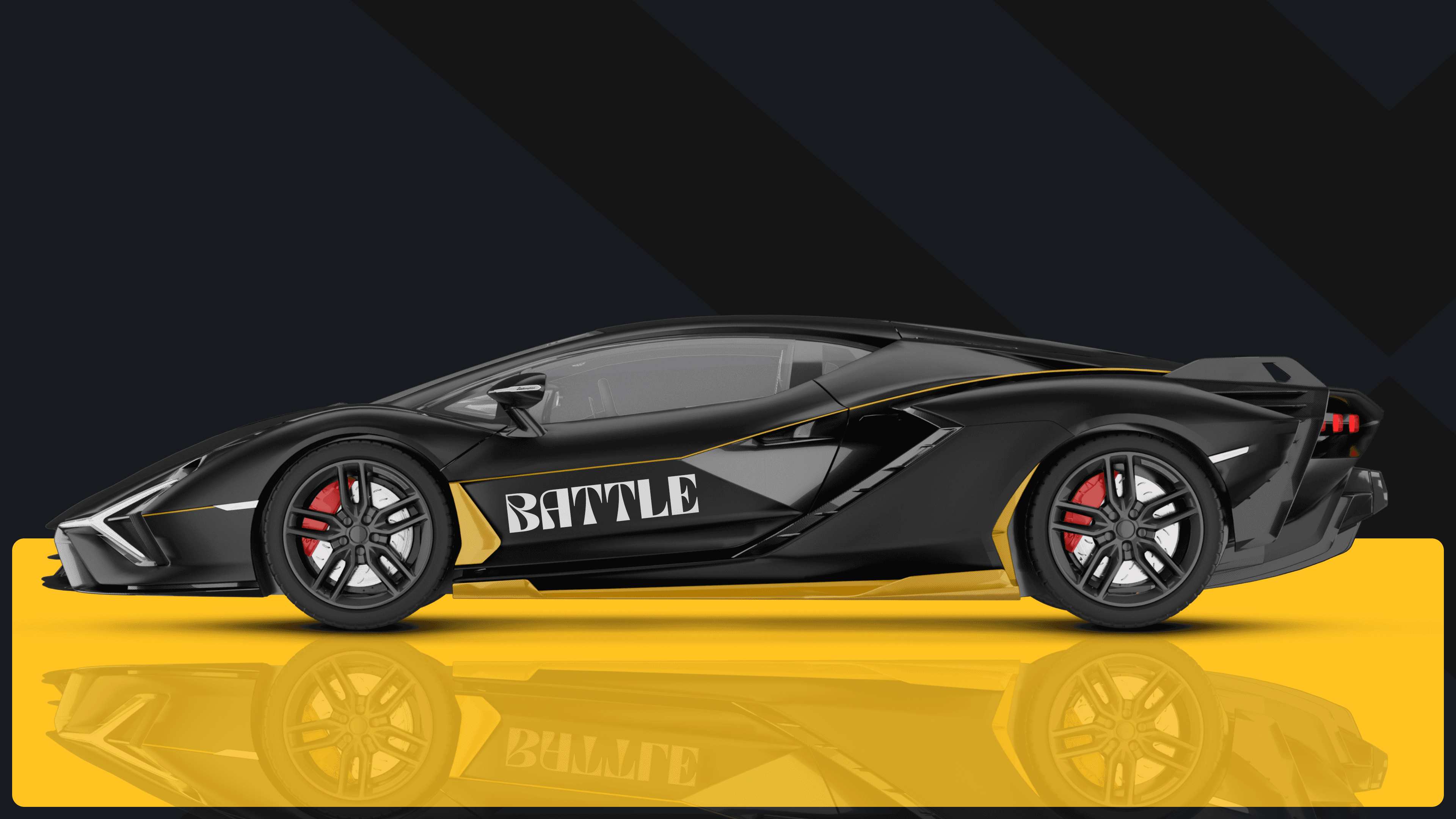
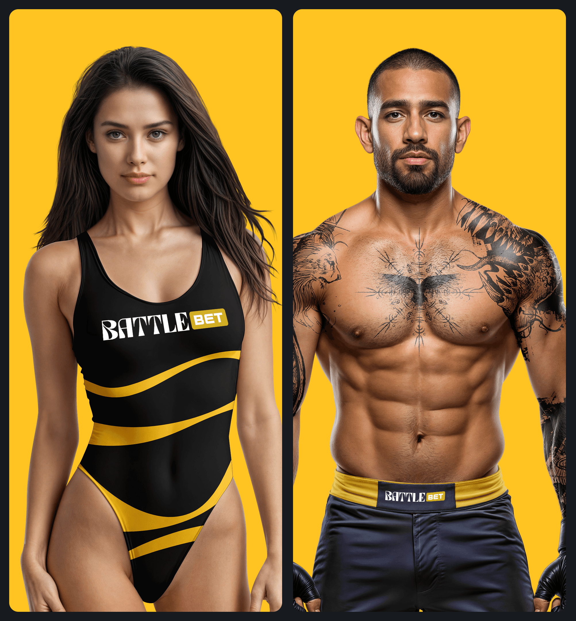
BattleBet isn't only about gaming it’s about pure adrenaline. We are dedicated to engaging and thrilling our community at every turn. Every piece of communication builds our story, cementing a brand presence that is undeniably electric and captivating.
Brasov, Romania
2026
iGaming
TBD
500+
Battle Bet Brand Voice
The Tone: Battle BET is the voice of an elite competitor at the absolute top of their game. It fuses the raw, visceral energy of the octagon with the sleek, uncompromising luxury of a high-stakes high-roller lounge. Every word is sharp, deliberate, and commanding radiating the calculated poise of a strategist and the electric thrill of guaranteed victory.
Inside, you will find the strategic framework to channel the visceral energy and high-stakes luxury of BattleBet. Use these guidelines to keep our messaging powerful, electrifying, and distinct from the competition.
Do
Do: Deploy short, hard-hitting phrases that radiate power, momentum, and absolute control.
Do
Do: Fuse grit with glamour. Speak with absolute power, but wrap it in elite sophistication.
Don't
Don’t: Overcrowd the message. True power is concise; give your statements room to hit hard.

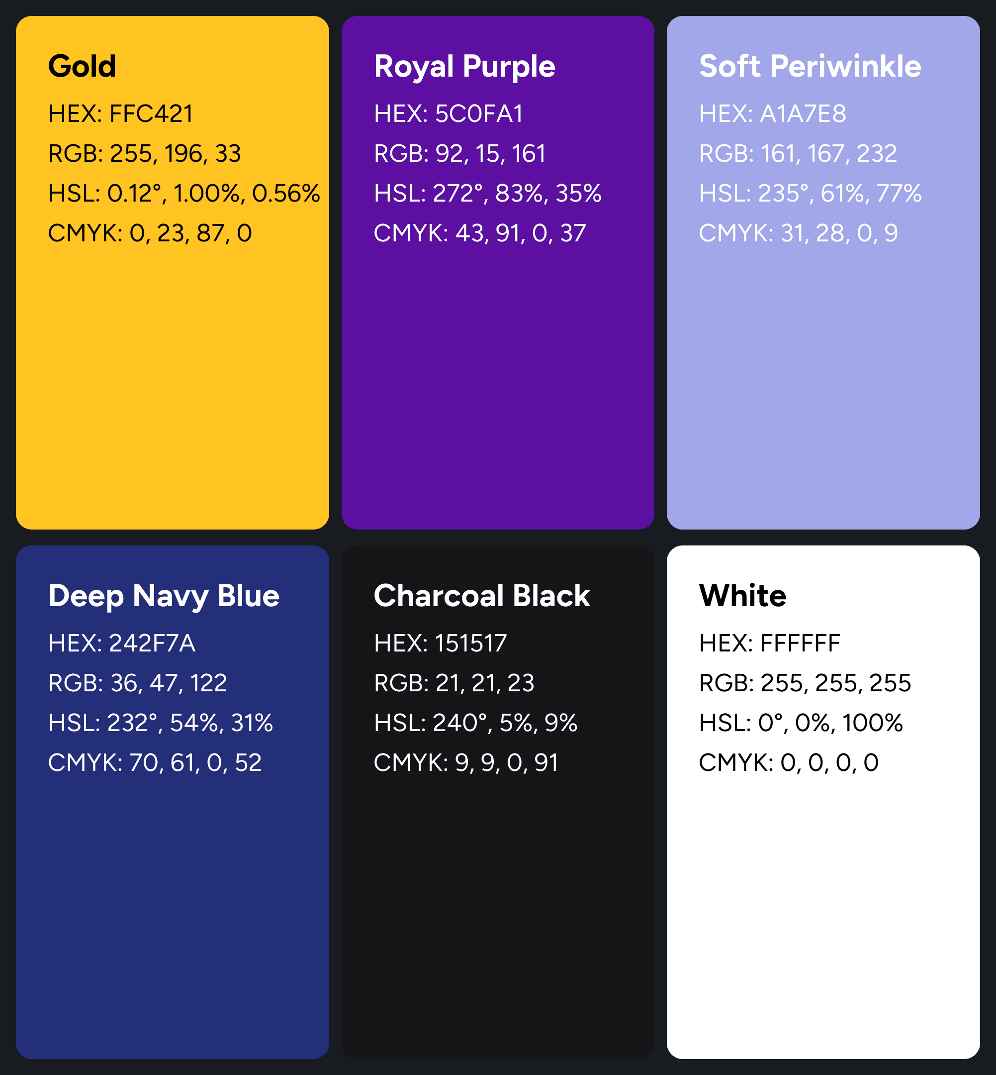
Battle BET Color Palette
This palette perfectly mirrors the brand’s dual identity: a striking fusion of high-octane combat energy and prestigious, luxury casino aesthetics. The deep, dark base notes provide a sleek, premium backdrop, allowing the vibrant regal tones to command attention.
Primary Accent & Luxury Tones
Gold (
#FFC421)The Vibe: Championship gold. It radiates victory, premium status, and the ultimate reward. It is used strategically to highlight elite actions, VIP tiers, and winning moments.
Royal Purple (
#5C0FA1)The Vibe: Regal and exclusive. This deep purple injects a sense of high-stakes casino luxury and nighttime entertainment, elevating the brand far above standard sportsbooks.
Soft Periwinkle (
#A1A7E8)The Vibe: A refined, neon-tinted secondary accent. It adds a futuristic, sleek dimension that balances the heavy primary colors, perfect for subheadings, UI borders, or secondary interactive elements.
The Foundation (Base & Background Tones)
Deep Navy Blue (
#242F7A)The Vibe: The color of focus and strategic depth. This midnight-adjacent navy provides a sophisticated alternative to standard blacks, grounding the layout with a sense of stability, trust, and premium authority.
Charcoal Black (
#151517)The Vibe: The ultimate arena backdrop. Dark, sleek, and minimalist. This off-black texture allows the gold and purple to fiercely pop, evoking the feel of a dark, premium digital stadium or a luxury private lounge.
White (
#FFFFFF)The Vibe: Absolute precision. Crisp and unyielding, used strictly for high-impact typography, crucial data readouts, and clean, readable microcopy.
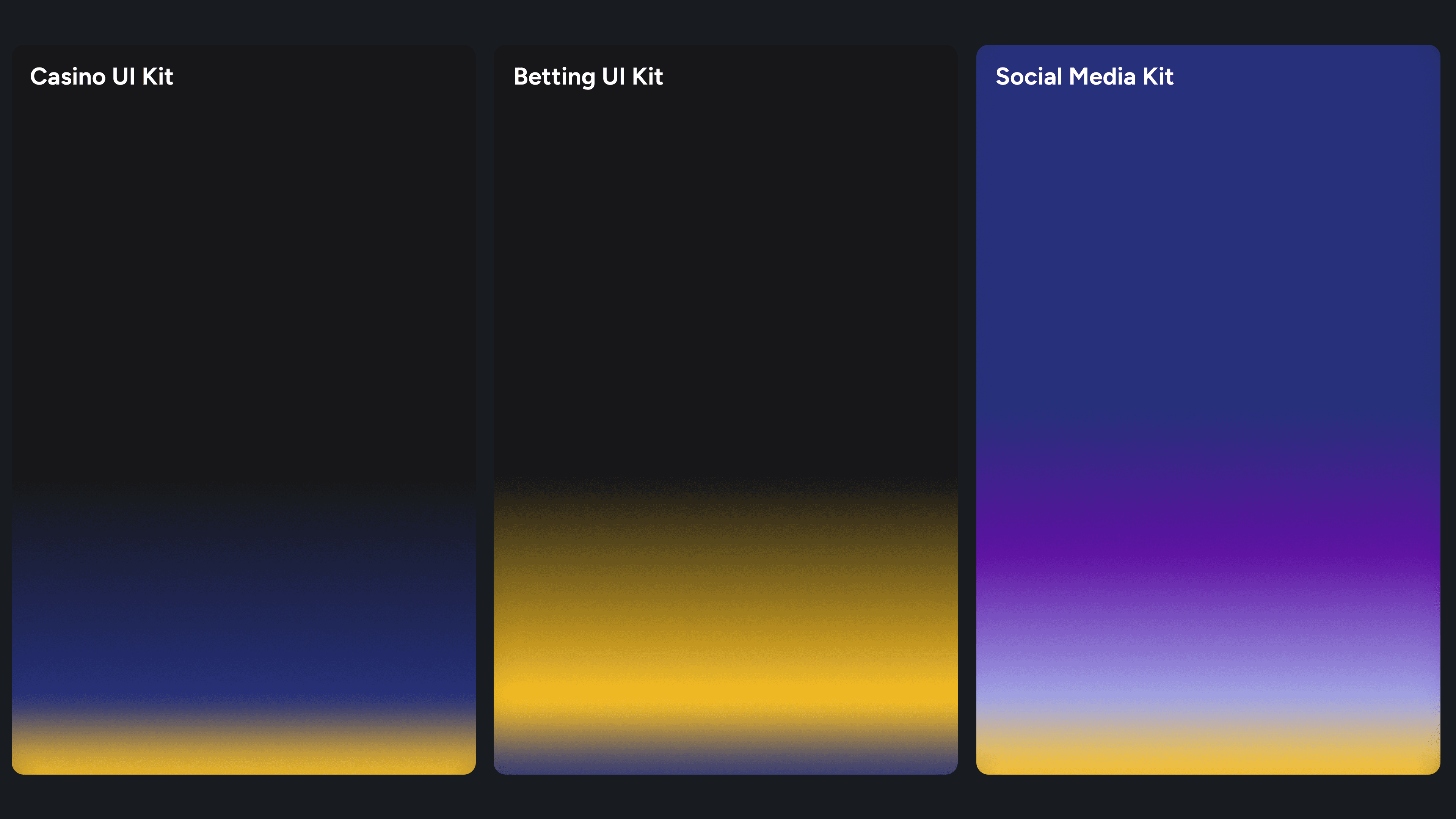
Casino UI
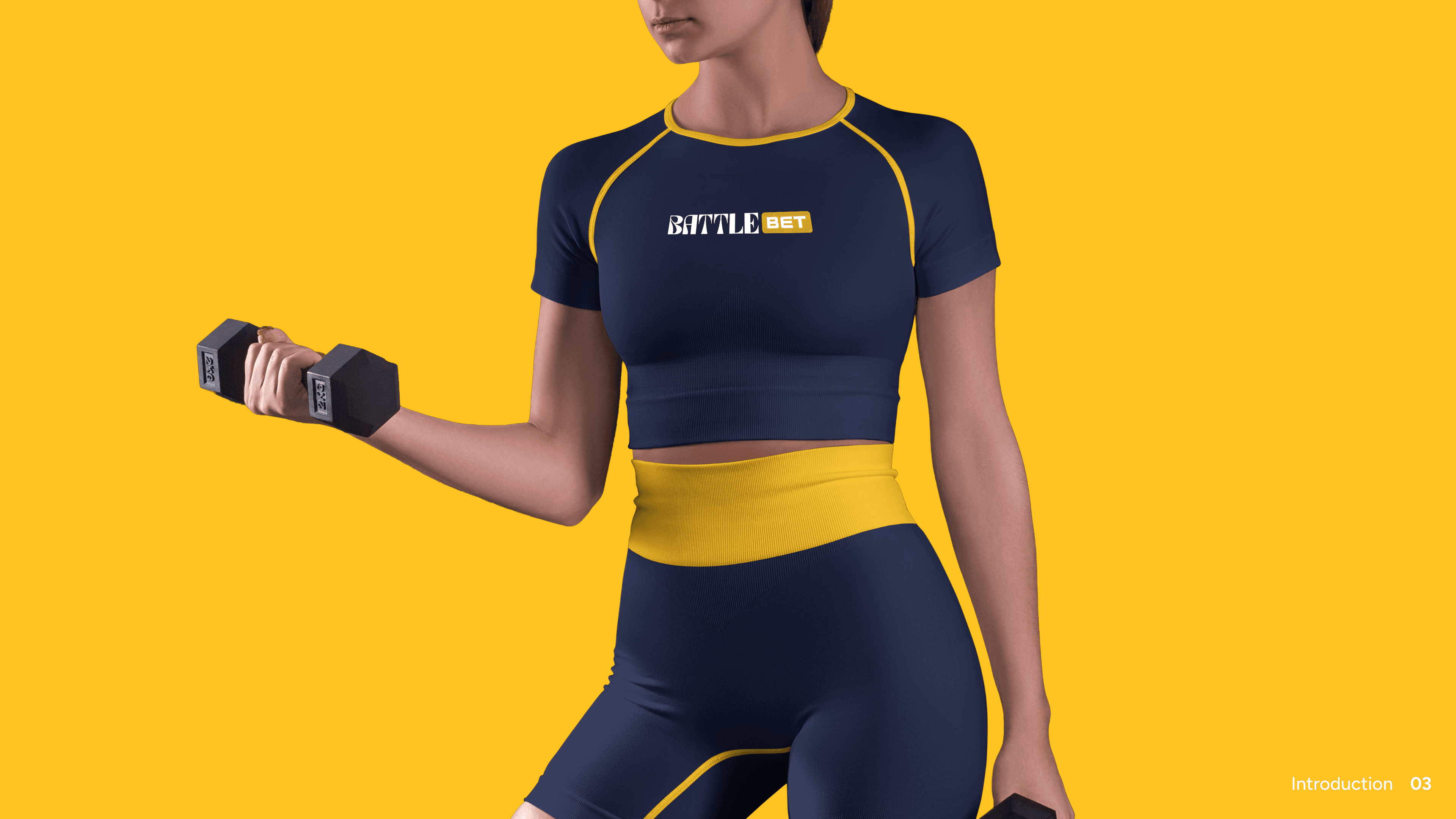
Dominance through dark luxury. This formula governs the casino experience, utilizing a premium balance of 60% Charcoal Black, 30% Deep Navy Blue, and 10% Championship Gold.
Betting UI
High-octane adrenaline. Built for the competitive arena, this layout shifts the energy to 60% Charcoal Black, 30% Championship Gold, and 10% Deep Navy Blue.
SM KIT
Engineered to capture attention in the digital space, this vibrant mix deploys 50% Deep Navy Blue, 20% Royal Purple, 10% Soft Periwinkle, and 10% Championship Gold.
George Cristian Grigore
Team Lead | RNG & RTP Systems
https://www.linkedin.com/in/gabriel-ciubotariu-3866aa151/details/recommendations/
Conclusion: Dominate the Arena
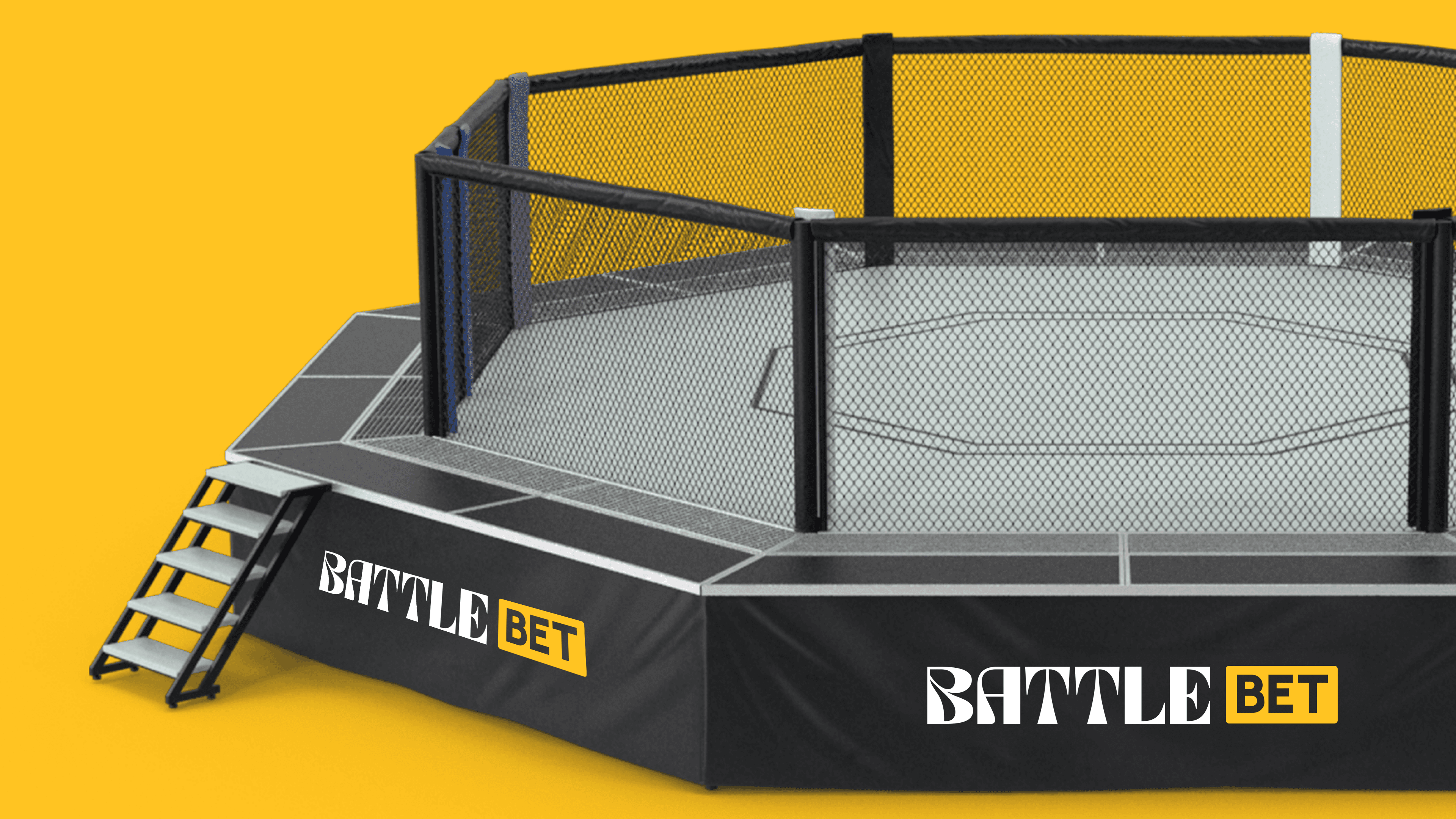
BattleBet is more than a platform; it is a premium arena where strategic precision meets high-stakes adrenaline. Every word we write, every color we deploy, and every interface we design must reflect this commitment to excellence.
We speak with the unyielding confidence of a champion and the flawless sophistication of a master tactician. By keeping our voice sharp, our visuals bold, and our message powerful yet controlled, we don't just participate in the market we command it.
Step into the lights. Execute the strategy. Claim the legacy.