Sepsi OSK: The New Era
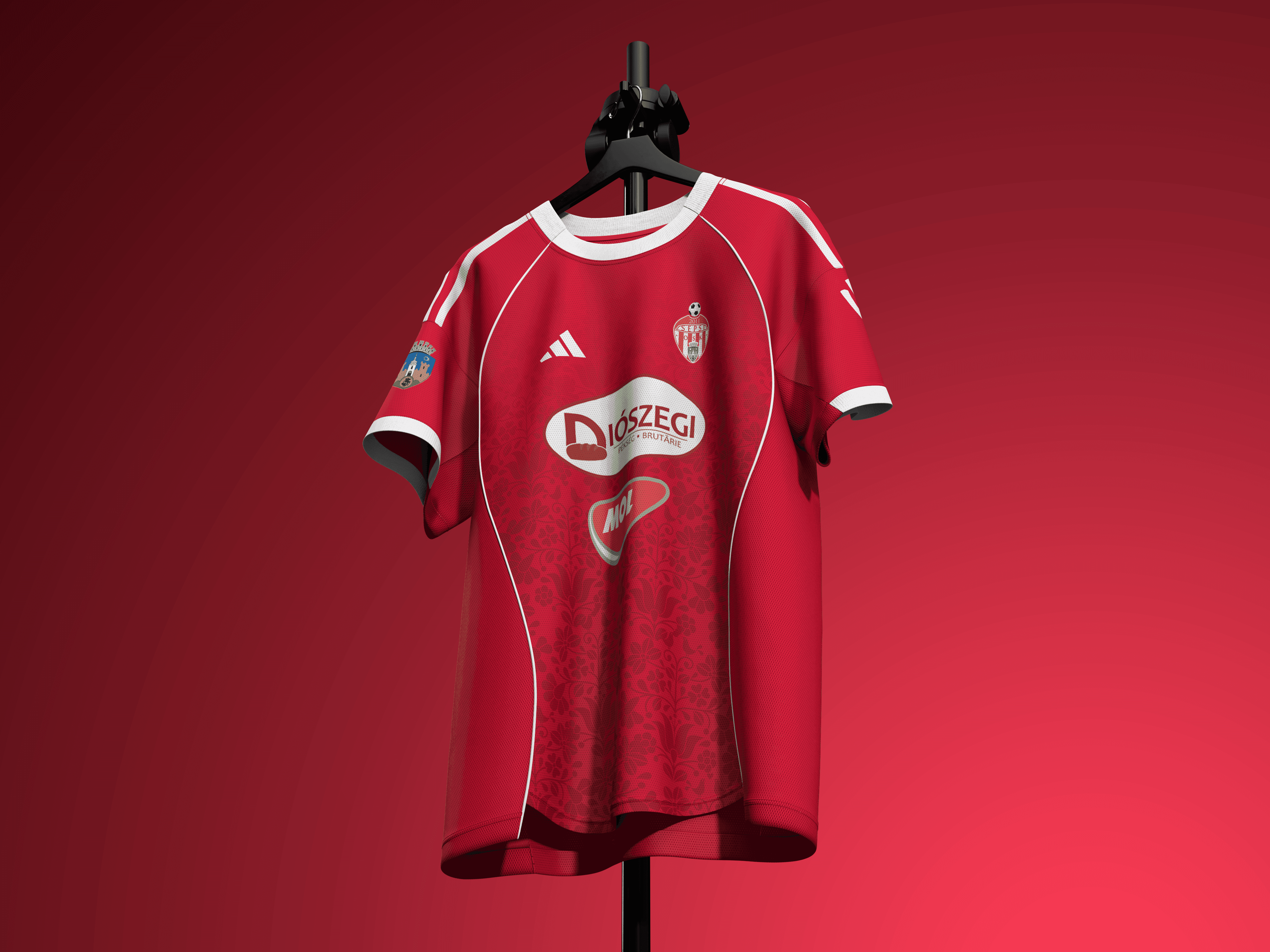
The revamp initiative aims to align the club’s visual representation with its high-performance infrastructure and sporting success. The updated visual system introduces a streamlined crest designed for digital versatility, symbolizing the club's stability and its modern approach to football management.
Social Revamp
2011
Sports
Challenge
Sepsi OSK is a club with a highly unique identity. Rooted deeply in Hungarian heritage but competing dynamically on the Romanian and European stages, the club needed a visual identity that honors its rich cultural origins while projecting the image of a progressive, elite football club. The goal was to bridge the gap between tradition and tomorrow.
The Vision: Heritage Meets Modernity
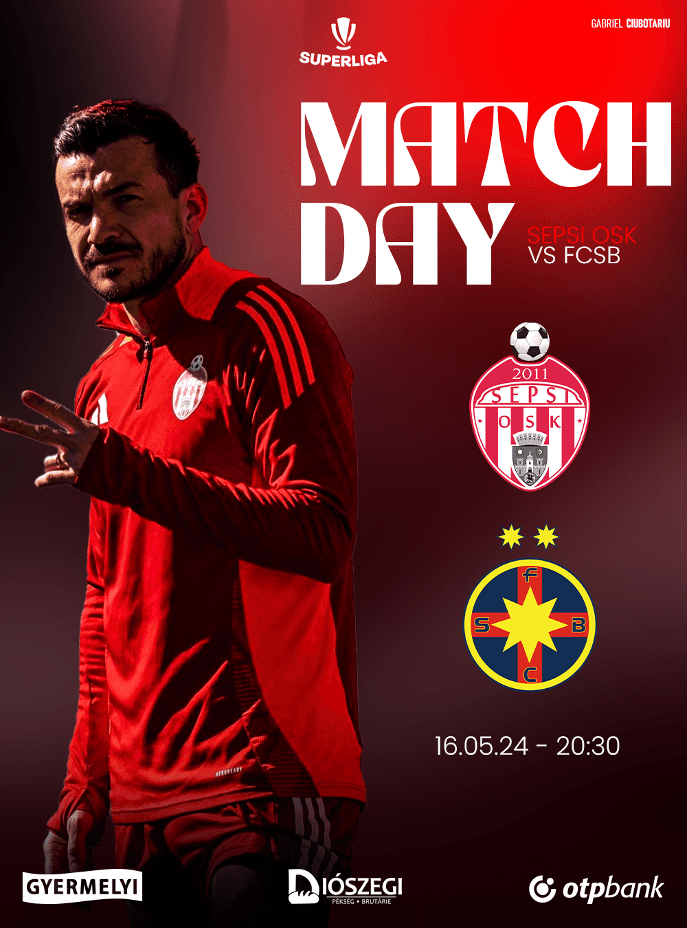
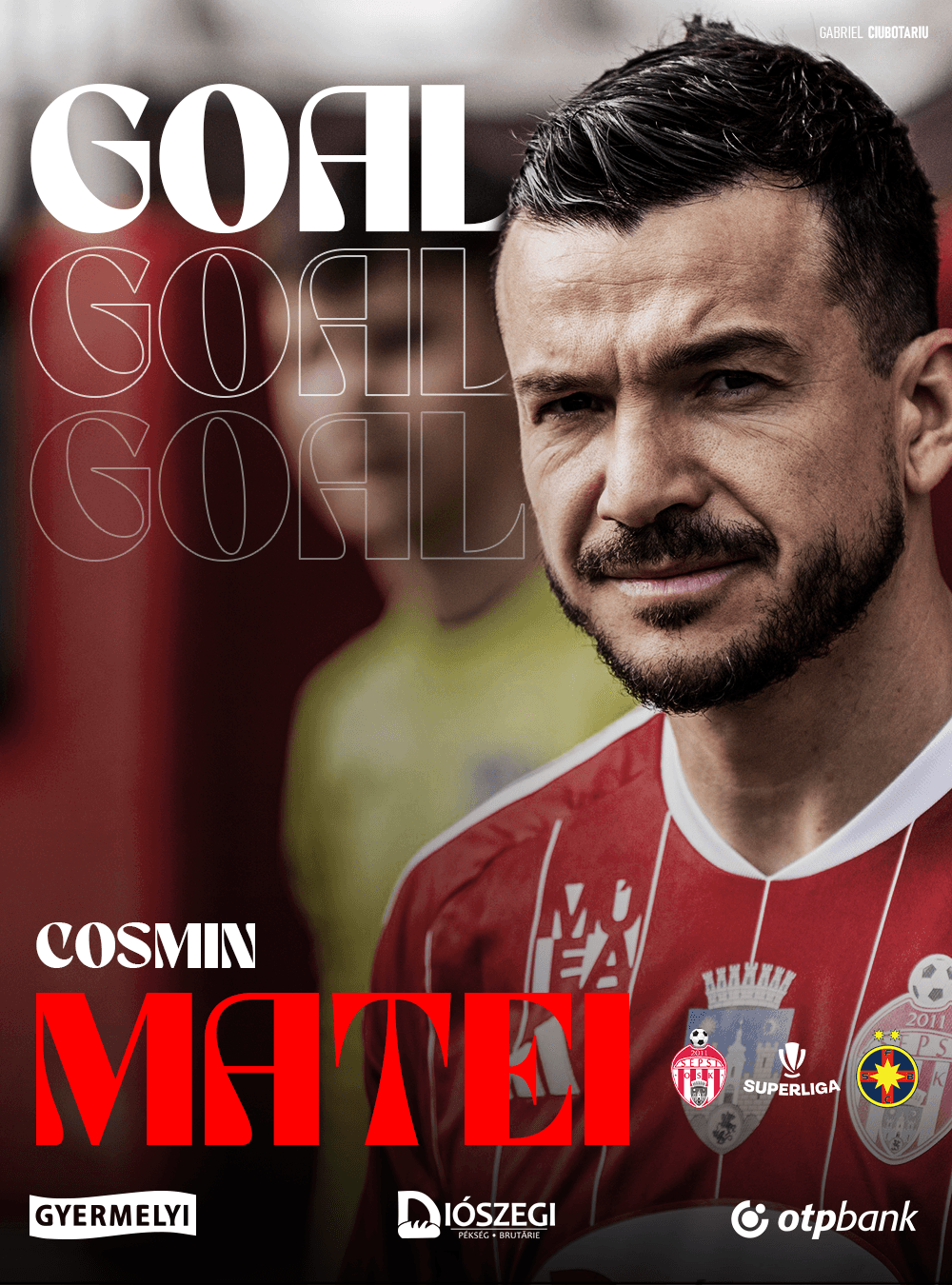
This revamp is a masterclass in balance. By marrying cultural authenticity with cutting-edge minimalist design, we’ve created a visual language that feels both deeply familiar to the core fanbase and incredibly fresh to the modern football world.
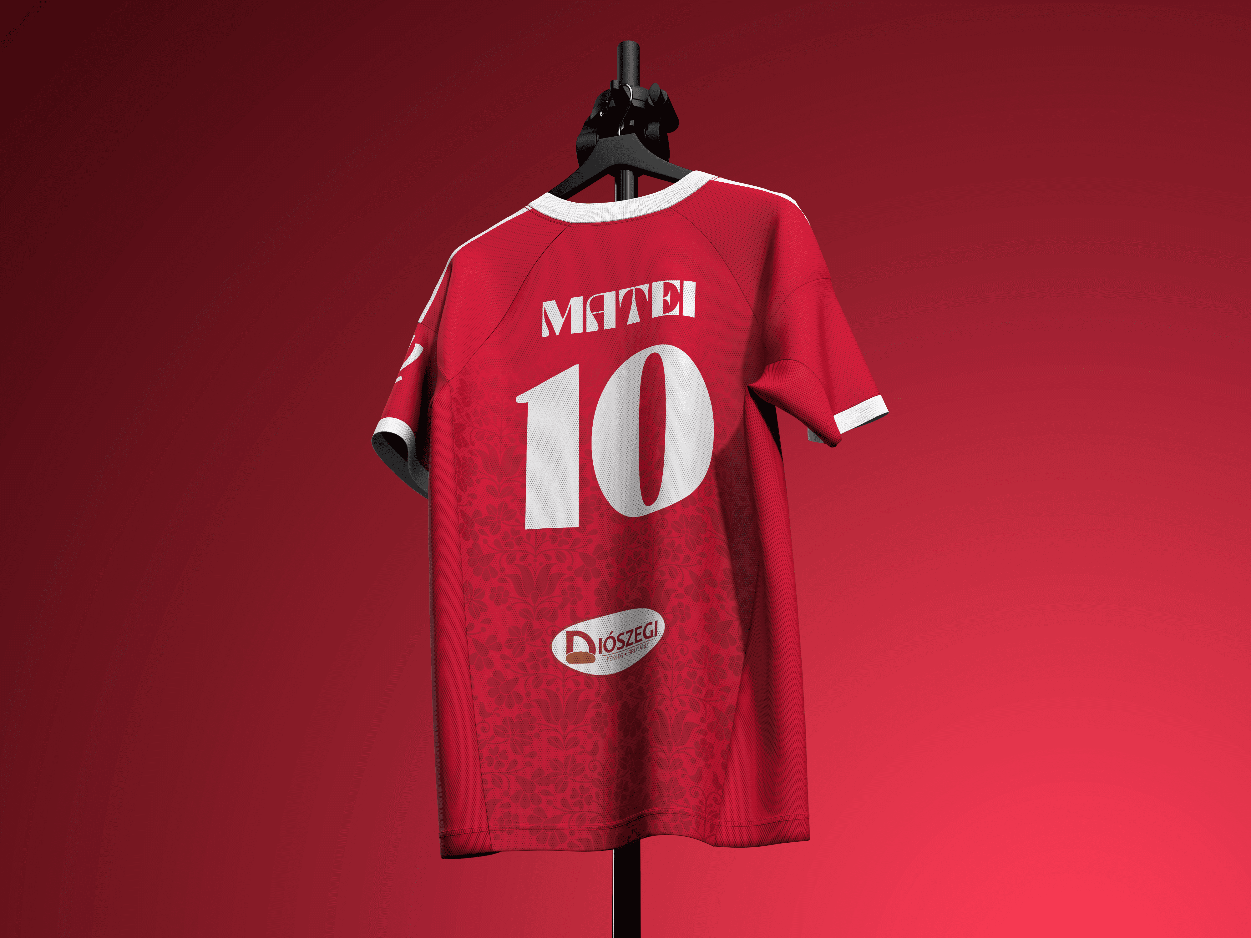
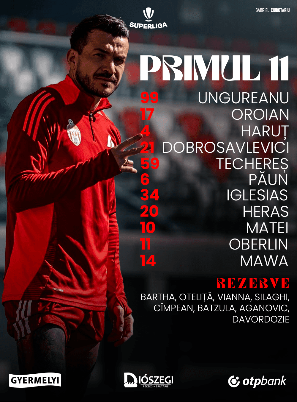
Cultural Motifs, Reimagined: Instead of shying away from the club’s roots, the design leans directly into them. Traditional Hungarian folk motifs are seamlessly woven into the graphics. They aren’t just decorations; they are geometric textures that tell a story of pride and continuity.
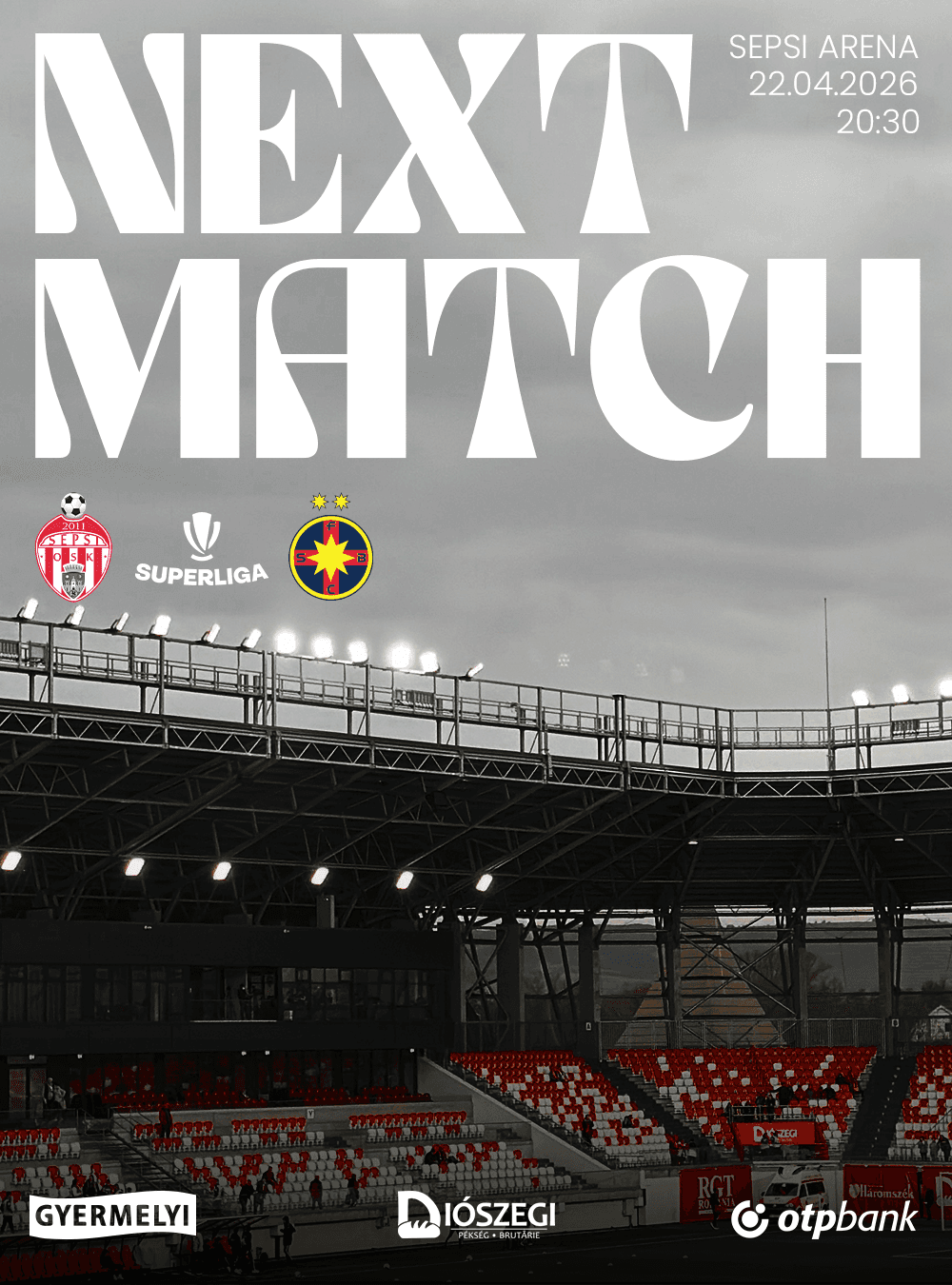
The Monograph Edge: To balance the historic motifs, the typography features Monograph, a sleek, modern font. Its clean lines and structural precision instantly elevate the brand into the contemporary sports landscape, ensuring high readability across digital platforms, merchandise, and stadium signage.
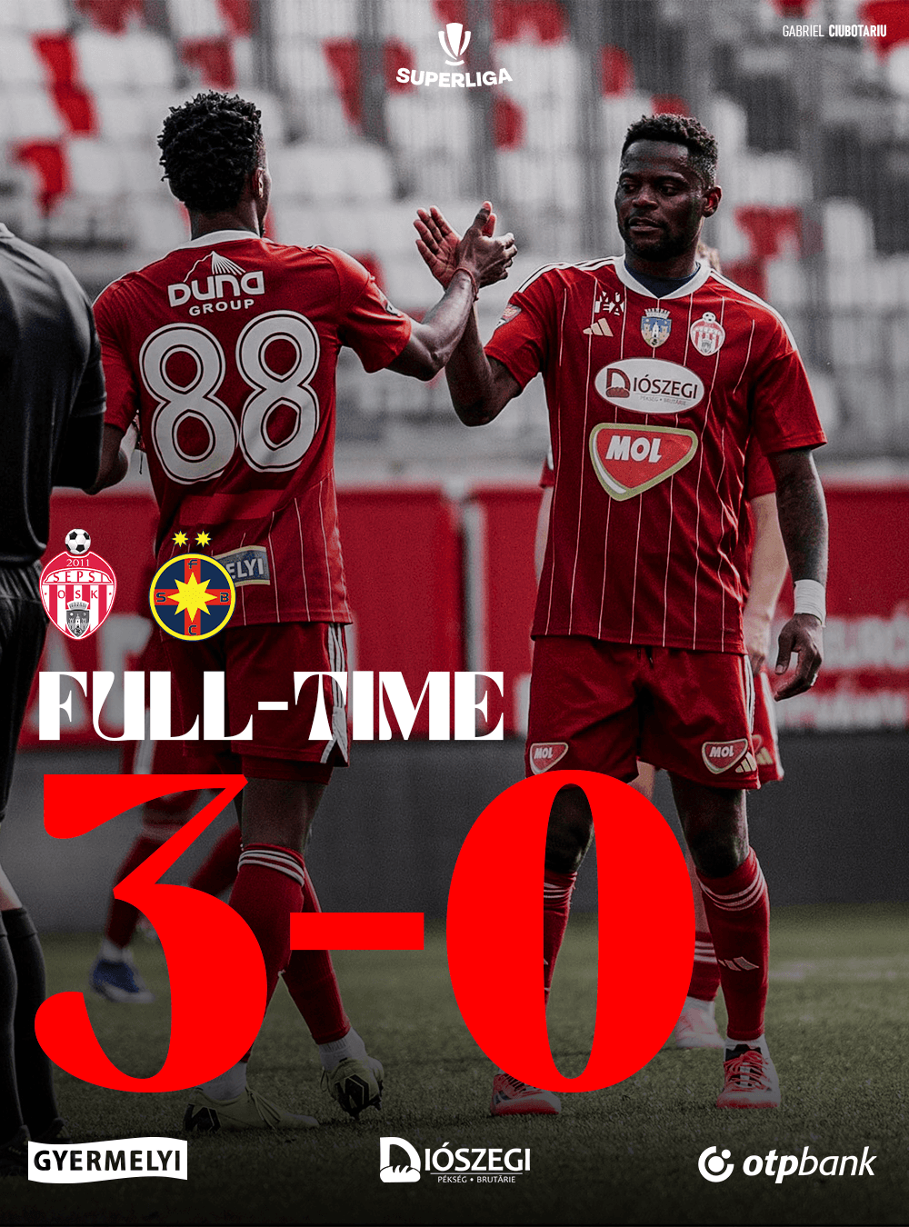
A Refreshed Palette: A refined color strategy breathes new life into the club's traditional look. These new tones add depth, premium contrast, and a sophisticated edge that stands out on television broadcasts and social media feeds alike.
Editorial Layout & Dynamic Imagery: The new layout philosophy prioritizes breathing room, striking compositions, and crystal-clear image treatment. By cleaning up the visual clutter, the players and the raw emotion of the game become the heroes of every graphic.


Dragan Laurentiu
Concept Artist
https://www.linkedin.com/in/gabriel-ciubotariu-3866aa151/details/recommendations/
Conclusion
This revamp doesn’t just change how Sepsi OSK looks, it changes how the club communicates its identity to the world. By taking traditional Hungarian motifs and filtering them through a sleek, modern layout with Monograph typography, this concept proves that a club can be fiercely proud of its past while being perfectly equipped for the future. It is clean, it is striking, and it is undeniably Sepsi OSK.